Table of Contents
Correlation pie chart
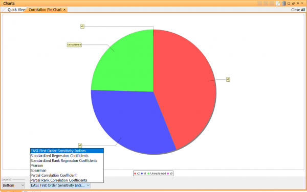
A correlation pie chart ranks the importance of the simulation inputs (parameters) on a specified output (at a specified timepoint) and displays the absolute value of the correlation rank coefficient for each input as a slice in a pie diagram. The correlation pie chart is only available with the sensitivity analysis toolbox.The chart is only available after a probabilistic simulation or a sensitivity analysis has been performed.
The correlation pie chart is an alternative to the tornado chart.
Creating a correlation pie chart
From the results window (Recommended)
- Right-click an output that you wish to plot and select Correlation Pie Chart from the popup-menu.
From the charts window
- Right-click the charts window and select Create | Correlation Pie Chart from the popup-menu.
Editing a correlation pie chart
Some properties can be changed directly by using the controls below the chart. For a pie chart there are controls for:
- Legend - Toggle legend on/off
- Correlation - Select ranking method (more information can be found below).
- Time-point - Select time point for the output.
To change other properties either right-click the chart in the charts window and select Edit, or double-click the chart, or click the  button in the title bar.
The chart editor has two tabs:
Properties
This screen let you edit properties such as name and axes, that are common to most charts. Please see editing chart properties for more information.
Data
- Output - Select the target output.
- Inputs - Select the inputs you are interested in. By default all parameters that are included in the probabilistic/sensitivity analysis are selected.
- Timepoint – For time dependent outputs, specify the time point you wish to plot.
- Max number of bins – Limits the number of inputs that are shown in the chart. Default=10.
- Type – Select which correlation ranking method you wish to use.
- Spearman’s rank correlation coefficient
- Pearson product-moment correlation coefficient
- Standardized regression coefficient
- Standardized rank regression coefficient
- Partial correlation coefficient
- Partial rank correlation coefficient
- EASI First Order Sensitivity Indices
